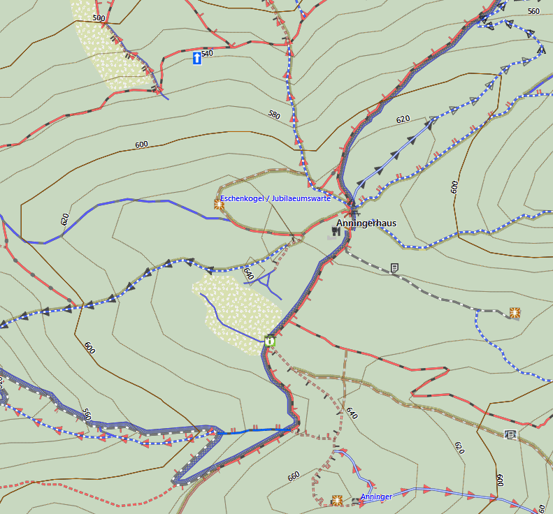
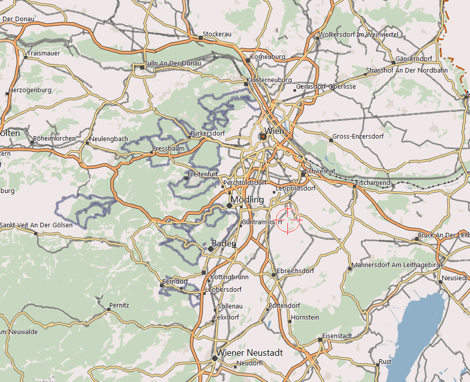
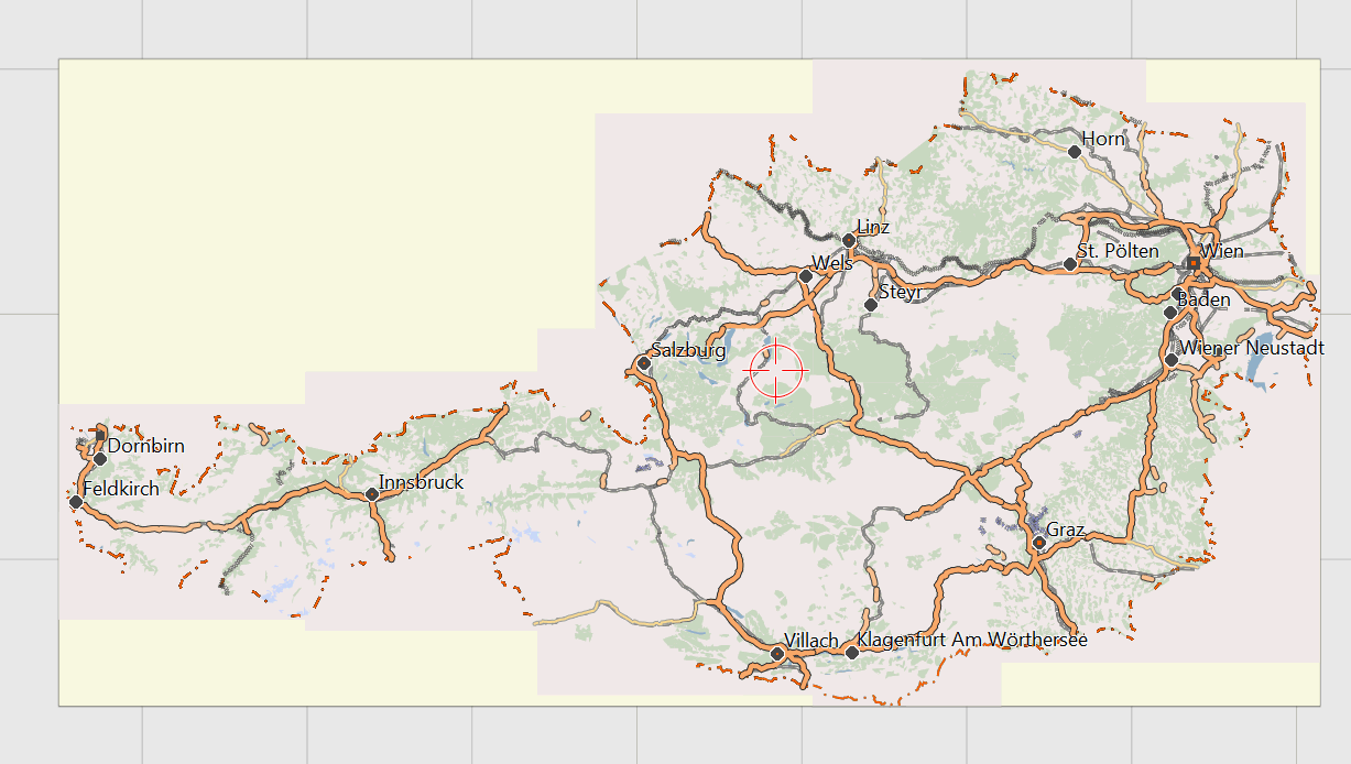
Please also see here - especially about the differences which layout to choose:
Just a collection of screenshots from Basecamp and Mapsource to give you an image on how the map looks like on your desktop. (note while you can choose to use the same layout on your GPS, it is recommended to use one of the 3 GPS layouts with higher contrast as they are easier to read with bad light conditions):
Note that the OpenMTBMap is a vector map that is drawn realtime on your PC/GPS. While raster maps are handdrawn and you would need one map for every resolution, vector maps are drawn realtime by your GPS/PC. This means that things like labels or density of streets/ways may be too much or too low. On the other hand vector maps are fully scalable, freely zoomable, rotatable (without letters being drawn upsidedown), autorouting capable, searchable, .... But hey, as you can see on the screenshots, the rendering quality is not far off from raster maps!


Following is a series of zooming into Germany Hamburg (1. shot: detail resolution from infinite to 70km)

(50-20km)

(15-10km)

(7-5km)

(3-2km resolution)

(1.5-1km resolution)

Note the following screenshot highlight too much information shown (the labels are not wisely chosen and interfere a bit) (700-300m resolution). But hey, on the zooming in phase this is basically the only one that is suboptimal.

This is the highest detail level (200m to 20m resolution). Note you can still zoom in closer without quality degradation of course. Only there is no more additional information showing up.

I updated the map in the classic version on Base Camp but I can no longer find the same view as in 2021 (ipg attached); in particular, I can no longer find the names of the forest roads. Do you have any advice for me? Thank you
Hi Maobotter,
that’s always a problematic decision – I removed the showing of names for forest roads on the .typ-files to decrease clutter. So they are only shown on mouse over in basecamp / or when clicking onto them on the device.
Hier sind 2 Screenshots von OpenMTBMap (gmapsupp.img). Mit dem Programm QMapShack auf ein Linux-System (Ubuntu 20.04). Läuft gut 😉
Die OpenMTBMap auf dem Garmin gpsmap64 und edge 1000