The past few months most of the work has been done on optimizing the map creation and on updating things on the website and website server. After a broken power supply fan caused the websites to be down for 20 hours in August I decided that I should, after 4.5 years migrate the website to a new server (server hardware is usually good for about 5 years of 24/7 use - then it should be replaced as failures are becoming likely). The broken fan on the PSU was really troublesome as the server provider did not find it first as the server would run just fine in rescue mode - but overheat quickly in real use then shut down. I then decided to also upgrade the map compilation server and optimize a lot of processes (e.g. I noticed that the map compilation was causing way too many writes to the NVME disks and had to optimize many steps and move things to ramdisk away from NVME in order to not prematurely destroy the NVME drives. This excessive writes became apparent with the introduction of the 10m contourlines, and the VeloMap buildings layer).
Also I reworked the whole map creation to create bigger tiles so that you can install larger areas to your devices without suddenly missing an area without any notice because of hitting the 2048 or 4096 tile limit. Devices with 4096 or higher possible tile limit should now be fine with map tiles averaging around 8-10MB (so 4096*8 >> 32GB sd card limit of Garmin devices). I still recommend to only install 6-8GB of maps to a device for speed at boot and search functions (deactivating a map in the GPS device menu does not help with speed of boot or search) but bigger tiles are always a good thing.
Besides countless bugfixes I also worked on a map layout compatible with the 64 colour display of the Fenix 5/6 watches. This was rather complicated as the Fenix watches not only, only have 64 colours - but many of them are hard to distinguish while other colours are so low in contrast that they are hardly visible. I've listened to both user feedback and also got a Fenix 6x to work on it locally. The resulting colours are a bit different from the other maps - and look horrible on Mac/Windows PCs - but work pretty well on the watch itself. Yes the map display on the Fenix cannot compete with dedicated devices - but with the optimized layout it works pretty well to not get lost. Planning a route or a track on the Fenix is pretty cumbersome - but following a route/track downloaded from the net / created in Basecamp works very well now.
Here are some pictures of the map with the new fenix layout - reflecting pretty accurately how the maps look in reality (the sunlight is already a bit low, with stronger sun contrast is better, in shadow contrast is worse - as normal for Garmin transreflective displays):
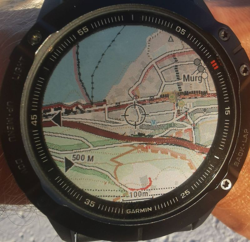
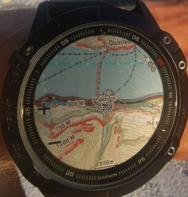
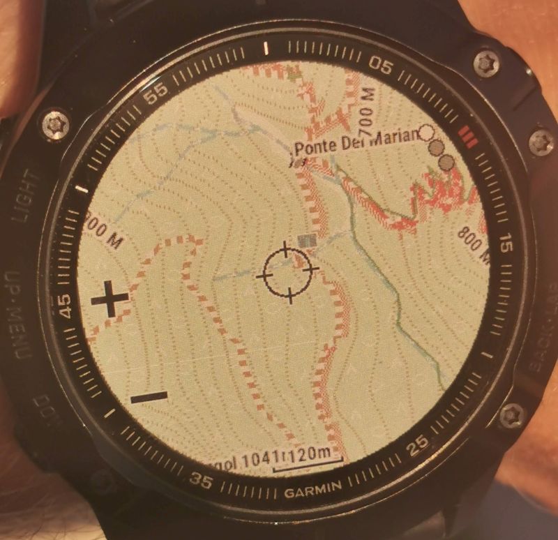

Notice how the vivid the colors are on the screenshots - other Garmin GPS devices do not have such a huge difference in screenshot vs real life.
So I had to really look for the poppiest of the 64 colors to get a nice rendering. I actually feel the problem is the pretty high DPI of the Fenix watches. they reflect sunlight much worse due to high DPI - with say 60% the resolution things would still be very sharp from normal viewing distance - but with better contrast (Still the Fenix 6x is really good for hiking - for mtbiking I think it is a backup only. The screen is simply too tiny. For hiking it's great and much better than other smartwatches due to the great battery life - which could not be achieved with OLED display). Also due to the high DPI the Fenix layout now uses the widest lines I've ever used. E.g. contourlines are 2 pixels wide instead of 1.
While many people really like the new layouts introduced in July - others preferred the higher contrast of the old layout style. So I backported some important improvements to the old wide/clas layout and they are now included as wide legacy and clas legacy layout. With the introduction of the Fenix layout and the legacy layout I decided to retire the thin layout - however I optimized the clas and clas legacy layout to work better on some older edge devices which before were used best with the thin layout. I cannot maintain too many layouts so the thin layout had to go. Also I spent many hours optimizing the contrast on the new modern (yellow streets) layout so it's easier to differentiate bigger from smaller roads.
And another big update that is visible to all VeloMap users - I decided to move the buildings into a separate layer for the VeloMap just like the contourlines. Before I had gradually decreased the buildings shown to improve map drawing speed on GPS devices and a better contrast for the rest of the map - but it is hard to satisfy everyone here. Some people want to see buildings, others feel they slow down the map in bigger cities as well as simply not needing them. Now you can chose to display them or not and activate/deactivate them just like the contourlines. I guess that most OpenMTBMap users want buildings - so for the OpenMTBMaps they buildings are not in a separate layer.
There are quite a few more fixes on the installer - e.g. the size calculation of maps to be installed was wrong for maps with .7z files for inclusion. Or for some months highway=footway in the OpenMTBMap by default was only routable for foot. I had made a mistake there causing this bug some time ago. Natural=stone (France only) and natural=rock, natural=valley, natural=gorge as well was some other new OSM keys are now displayed. Also I worked on optimising other outdoor features like ridges, couloirs and aretes
The batch/bash files had not been fully compatible with 10m contourlines.
Personally my left knee is creating me big problems and I hope I can soon get stem cell cartilage (ACT) replacement - as I hope not to need a knee replacement not even being 40 years. But my past bad crashes from snowboarding and skiing, amongst 3 ACL replacements and a lot of meniscus removed have rendered my knee unable to do many sports. I hope to return stronger than every before during the last years but this will take quite some time to heal.
Recent Comments