As last weekend and Tuesday's national holiday coupled with bad weather gave me some time to hack, I worked many many hours on improving the map layout to make it more harmonic. Especially when zoomed far out, the map is now much better to grasp. For example for streeets with a cycleway=opposite or cycleway=opposite_lane or bicycle:oneway=no instead of the symbols for that, there is now a different oneway arrow - so it's less visual detail while carrying (nearly) the same amount of information.
I also kicked out quite a few POI because cities got too crowded. I kicked out all POI that in my eyes are neither needed for orientation nor carry much value for a tourist. This means for example no more trafficlights displayed in the map - as nice as they are, they are not needed for orientation but clutter up the map (their use for very acribic tripplanning-optimization is too limited I think).
Also I exchanged the colors for mtb and cycleroutes. The reason for this is, that in cities the blue of the cycleroutes is too disturbing, but also in grey/black the routes should still be noticeable. Outside of cities (where mtb routes usually are) there is no difference in my eyes in visibility whether a route is blue or black.
Another very disturbing factor, namely highway=unclassified roads are now less prominent. This is rather a defeat to the fact, that many mappers dont't understand what an unclassified road is and use it instead of highway=road.
Furthermore I changed a many POI color so that only very important POI do have color now, so POI disturb less. Inside cities this is a big help because POI do not distract from the roads as much, while on the countryside where there is less detail they are still as easily noticeable.
Overall I think the map layout got now much better adapted to the detail level we have in big German cities (or major European cities that are well mapped like Vienna). The old map layout was fine when cities where not mapped in detail like now (e.g. I do think that in the inner districts of Vienna by now about 70-80% of all restaurants, cafes, pubs and shops are mapped - compared to maybe 20-30% one year ago) so basically I adapted the layout to the fact that fewer and fewer details are missing in big cities.
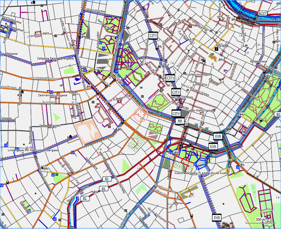
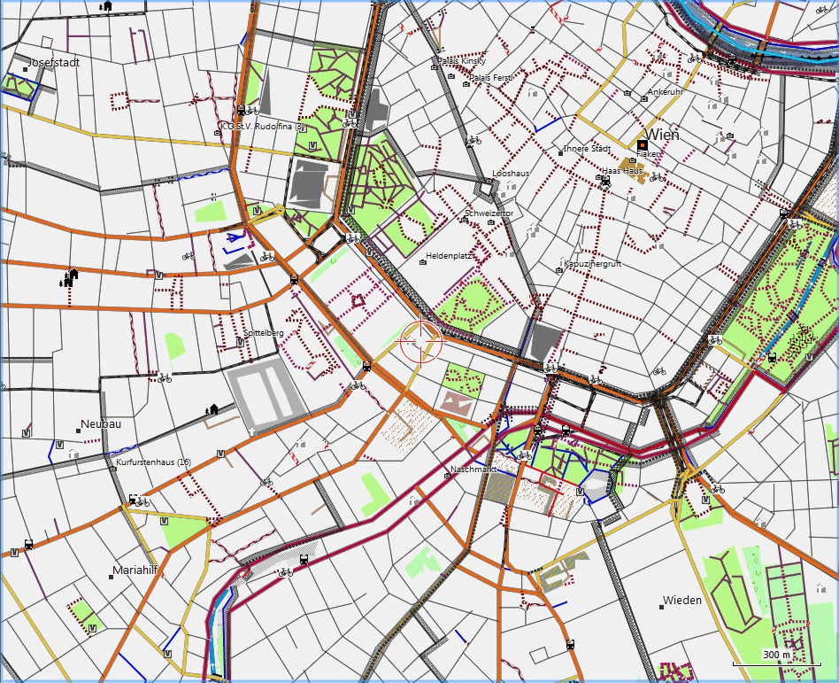
Old Map Detail:
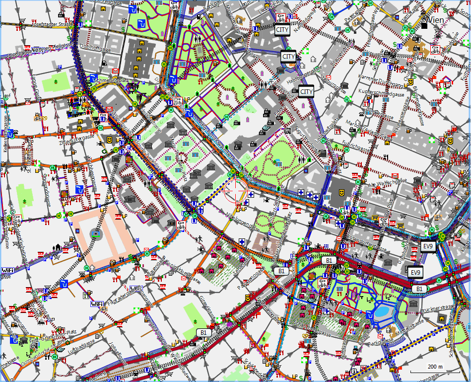
New Map Detail:


Recent Comments