Yesterdays post was about the general improvements to the layout of the OpenMTBMaps and VeloMaps. Todays post is about the new easy layout for the VeloMap (based on wide layout - as most users now have GPS devices where the wide looks better than the classic layout due to higher DPI). The OpenMTBMap had since many years an easy layout - with less detail (though based on classic not wide before the updates). For the VeloMaps - which do not need to show strong differentiation for offroad trails - this was not so much needed. Especially as there existed already the "race" layout - for racing bicycle which is heavily reduced and only shows important information for people using racing bicycles.
However quite a few people never took time or are not interested to know if there is a cycletrack/cycleway running alongside a road. Nor do they want the best contrast or are they interested in knowing if there is a footway or a pedestrian street. Or if some street is considered a service street or a residential street. The easy layout does not show those differences and keeps it simple. The colours of the steets is similar to google maps - while trying to still maximise contrast on your screen but without changing the colours too much.
It still differentiates long distance cycleroutes from regional/local cycleroutes. Why do I consider this essential? Well if you follow along for example the "EV6" - commonly known as Danube Cycle Path / Rivers Route you don't want to be confused at intersections with many regional cycle routes which route is the EV6 and which is the regional one. Yes I already render the long distance ones thicker - but I still consider that the colour should be different. So International and National cycle routes are shown in blue, while regional ones are shown in black (this is not only applying to the easy layout, but to all VeloMap layouts).
The principle to understanding the map colours is still very easy - streets also for cars are shown in bright colour. Pathes that are either not allowed for cycling - or more suited for mountain bikes only due to bad surface - are shown thinly or in brown colour. Black/dotted black is used for pathes/streets with good surface and usually no / not much cars. Very thin dotted black are used for unknown way quality (often private pathes or access to houses)
So let me show you some Screenhots of old vs new, or just the new easy layout:
First an old screenshot of the VeloMap Austria - Park Schönbrunn in the wide layout.
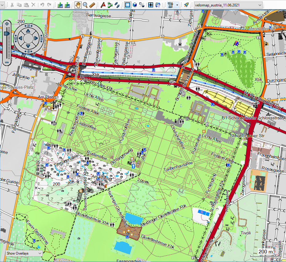
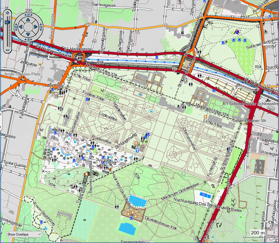
vs the improved new wide layout - the big differentiation here is that I show national parks and similar now only transparent in green - not overlaying anymore. Plus toned down the buildings and sports places:
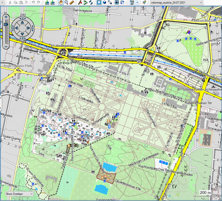
and finally the much simpler easy layout. Note that in the top right - the wide layout shows the cyclepath on the Mariahilfer Straße (light blue dots) - which are left out in the easy layout - also of course the different colour scheme for roads:
Some more examples:
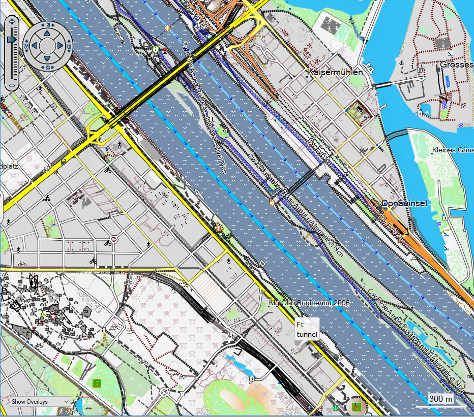
A good overview of the street colours in the easy layout for the VeloMap. Motorways and trunk roads are in orange. Primary/Secondary/Tertiary roads are shown in yellow - Primary roads in the most flashy yellow - while tertiary are thinner and in a less bright yellow. The EV6 and EV9 in blue, regional cycle routes in black.
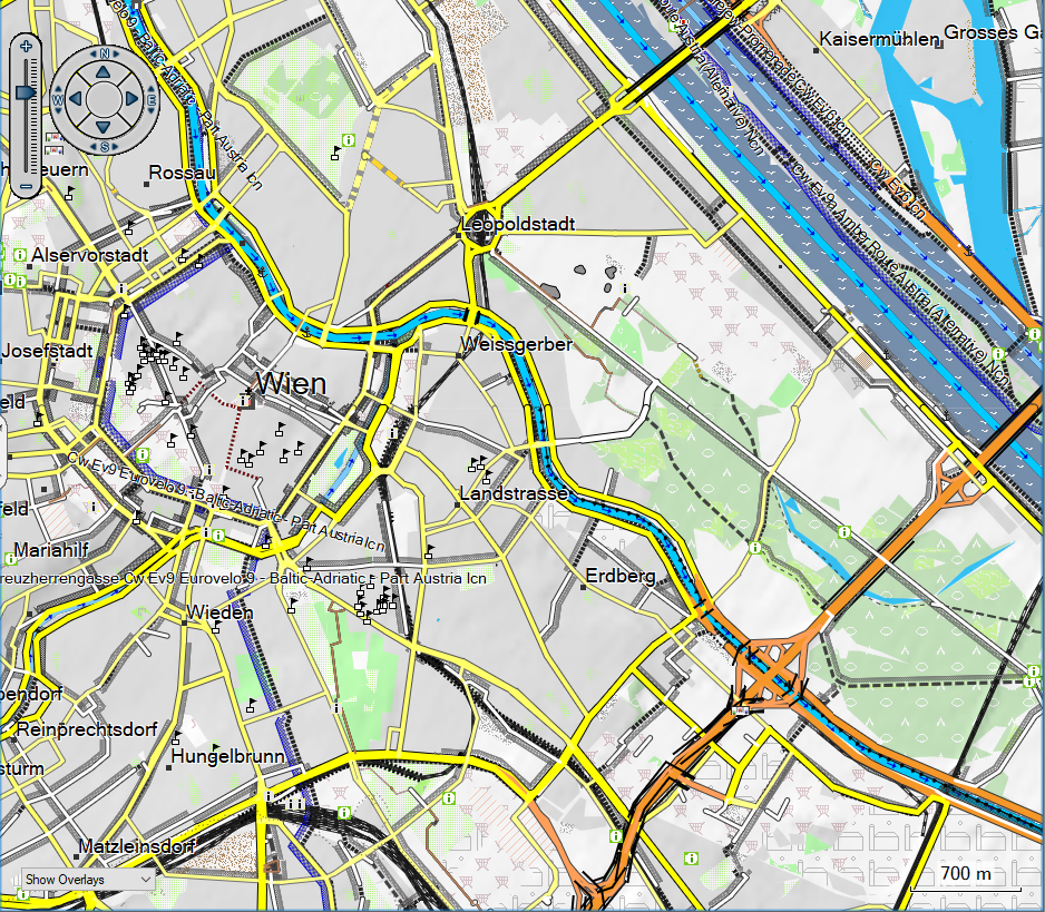
The Danube in Vienna - and the blue EV6 danube cycle path. Sadly I cannot easily influence which lines are shown on top of each other. The garmin map format is not supporting a layering/ordering of lines. So the blue marking for the cyclepath sometimes disappears behind other roads. This is especially happening if in OSM parallel ways are mapped as separate ways - instead of using the cyclelane/cycletrack keys. Zoom in further to avoid confusion.
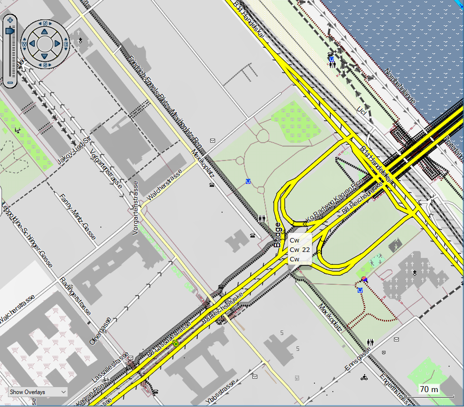
70m easy - at 70m for most cases it becomes very easy to follow the cycle routes. Also good to see here - the difference in oneway arrows. The ones made up of two triangles besides the road - are only for cars. While the ones consisting of a thinner single arrow are valid for all vehicles including bicycles. Tell me in a comment here if you would prefer I do not show oneway arrows that only apply to cars in the easy layout. I am a bit unsure about it. Do you still want to know this (usually you have to ride much more careful if only cyclists are allowed to go in the opposite direction - and the danger of being in an accident is a lot higher) Or should I leave those arrows out in the easy layout and only show oneway arrows that apply for both cyclists and cars?

I wanted to get two different type files on my device to try and see the differences like how its going in practise.
To get that I was creating two -seperate- .img files, each with a different typ file … once the hiking layout, one with the MTB layout.
However my GPSmap66 only shows one of both files.
I recognised putting a VeloMap next to a OpenMTBMap shows two files I can chose from. Using two OpenMTBMap files (img-fiels) with differnt typ definitions only shows one.
Question: is there a way for changing the layout on the device while using / can I get two same cards with different layouts to chose on the same device?
Thank you
to add on: I LOVE the fenix layout … just tried that with the watch. Great workt here! 🙂
Only by using two regions of different maps. Like extract of Europe map and country map
awesome, I will try. Thanks for the rocket-fast answer.
Hallo, ich nutze immer noch mein Garmin 60CSX. Das Layout THIN wird bei der Installation nicht mehr angeboten. Wie kann ich das trotzdem hin bekommen? Das Classic Legacy Layout bringt zu breite Linien…
VG Dirk Meyer
Ich habe das Thin Layout aufgegeben – es wurde zu wenig benutzt und ich kann nicht beliebig viele Layouts anbieten. Evtl mache ich das Classic Layout geringfügig schmäler – sind die Linie für dich generell zu dick, nah hereingezoomed zu dick, mittig zu dick, oder weit herausgezoomed zu dick?
Danke für die schnelle Aufklärung. Also, nsbesondere bei dichtem Wegenetz und nah hereingezoomt gehen die Konturen der Wege verloren, da sie einander mehr berührenn, bzw sogar überdecken. Das Thin Layout hat mehr aus dem Display herausgeholt. Insofern wüprde ich eine Verschnälerung des Classic lAyouts begrüssen.
Vg Dirk
Using create_gmapsupp_img_velomap_with_mkgmap.bat there are no Easy only
press 0 for velo*.TYP (Layout optimized for small GPS screen)
press 1 for trdn*.TYP (Layout for Mapsource, Qlandkarte or pc screens. Low contrast for big resolutions (800×600 and up). No good on GPS. Simpy reinstall with other .TYP before sending maps to GPS.)
press 2 for velw*.TYP (Layout optimized for high resolution (e.g. Oregon) screen.)
press 3 for race*.TYP (Layout optimized for race biking / road biking. Optimized for GPS screen, but still quite good on Desktop.)
Oh yeah, forgot to update that one. Rename the easy to velw for example or wait for next week update
Ah thanks, new WideEasy Layout looks very nice.
Where can you download the new style?
all maps except the Europe continent map are already using it – chose the easy or hiking layout (the other layouts are also already updated – except for Europe continent map – which will follow in a couple of days)